


Jo lives in a particularly picturesque part of the Cotswolds, with a garden inhabited by an assortment of chickens and two charming ducks who look as though they’ve stepped straight out of a Beatrix Potter tale. She reels off each of their names as she introduces them to me.
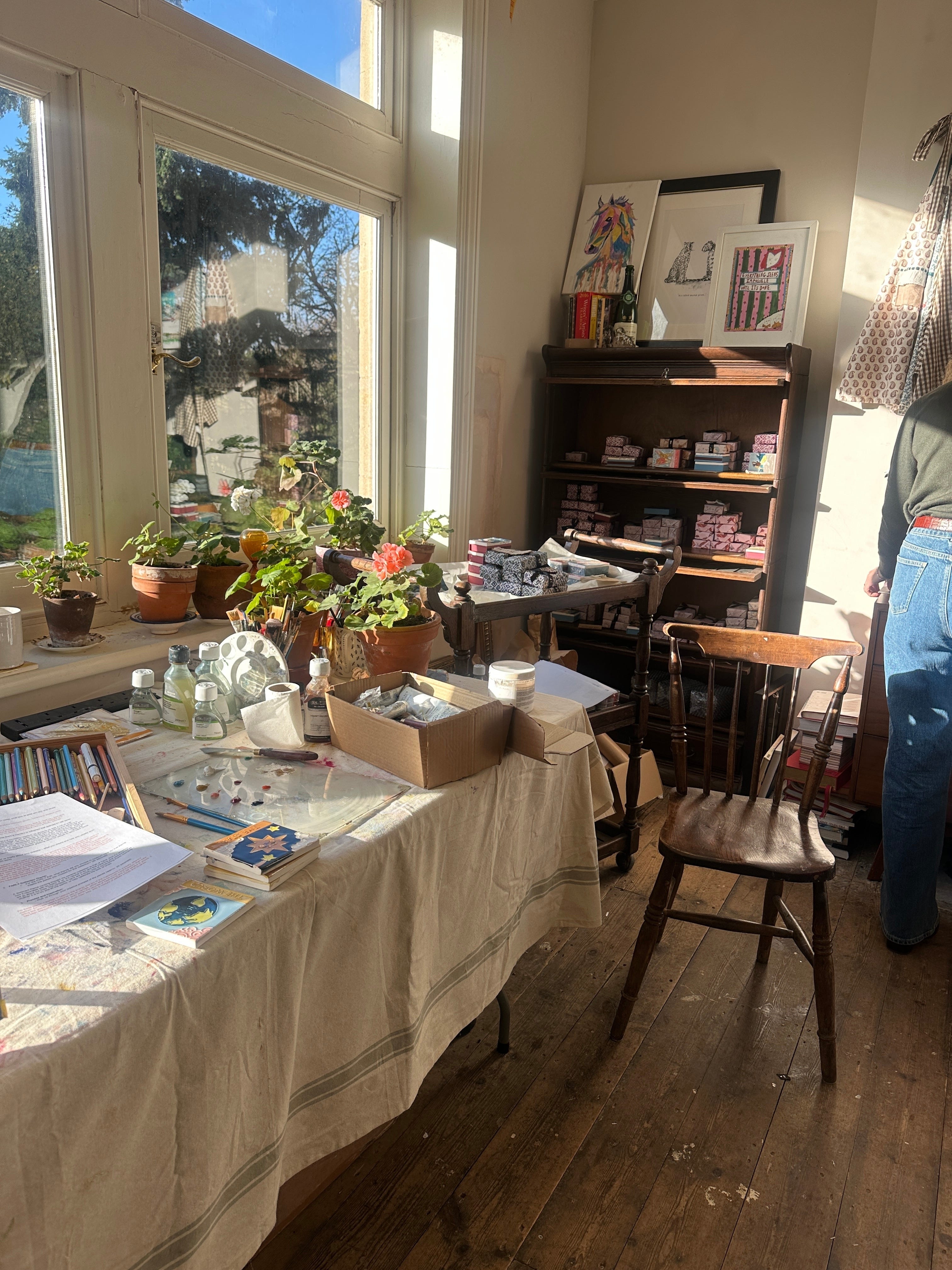
Her studio in the main house is bright and inviting, with ceramic matchboxes scattered across the surfaces and brushes, inks, and sketches gathered in lived in clusters.
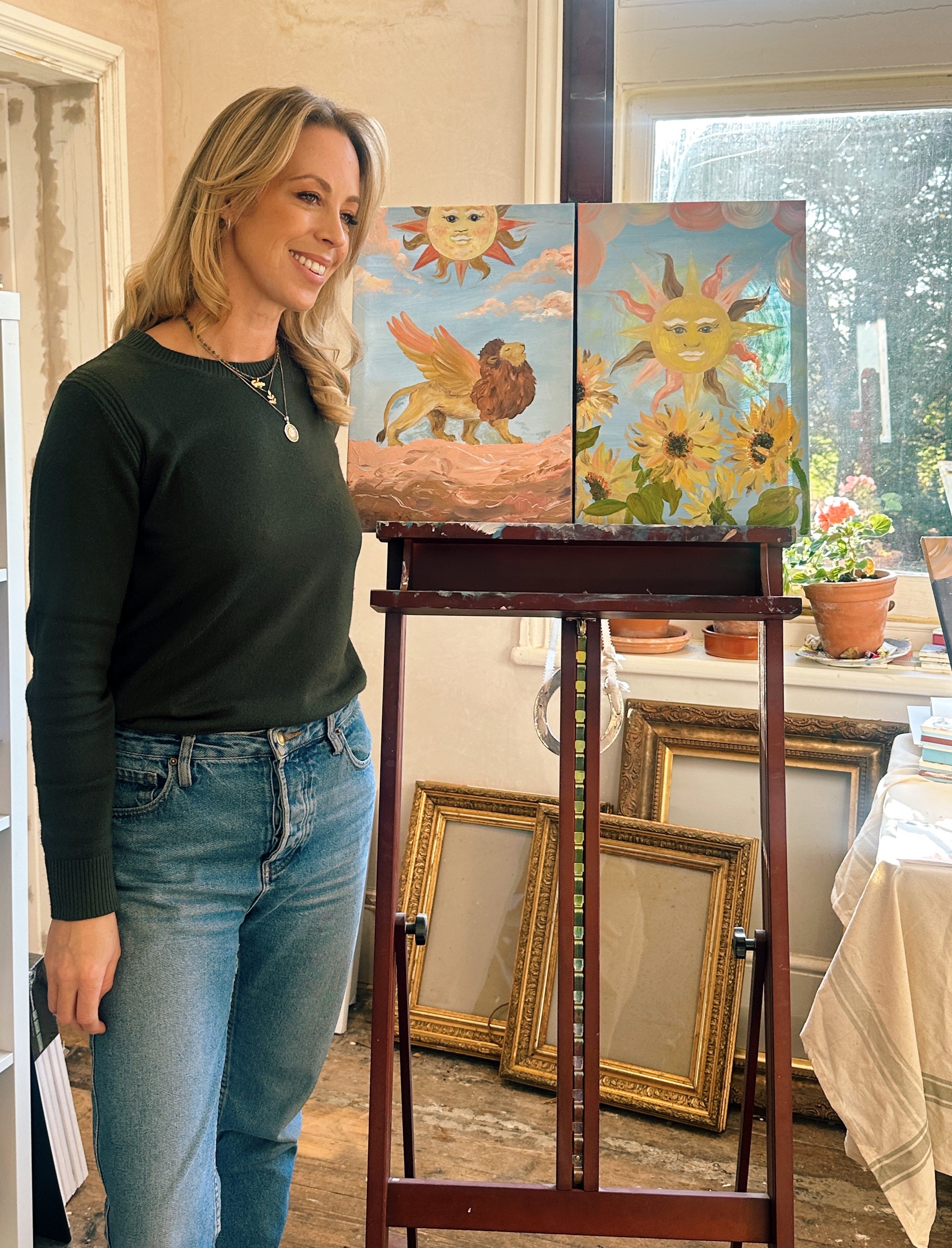
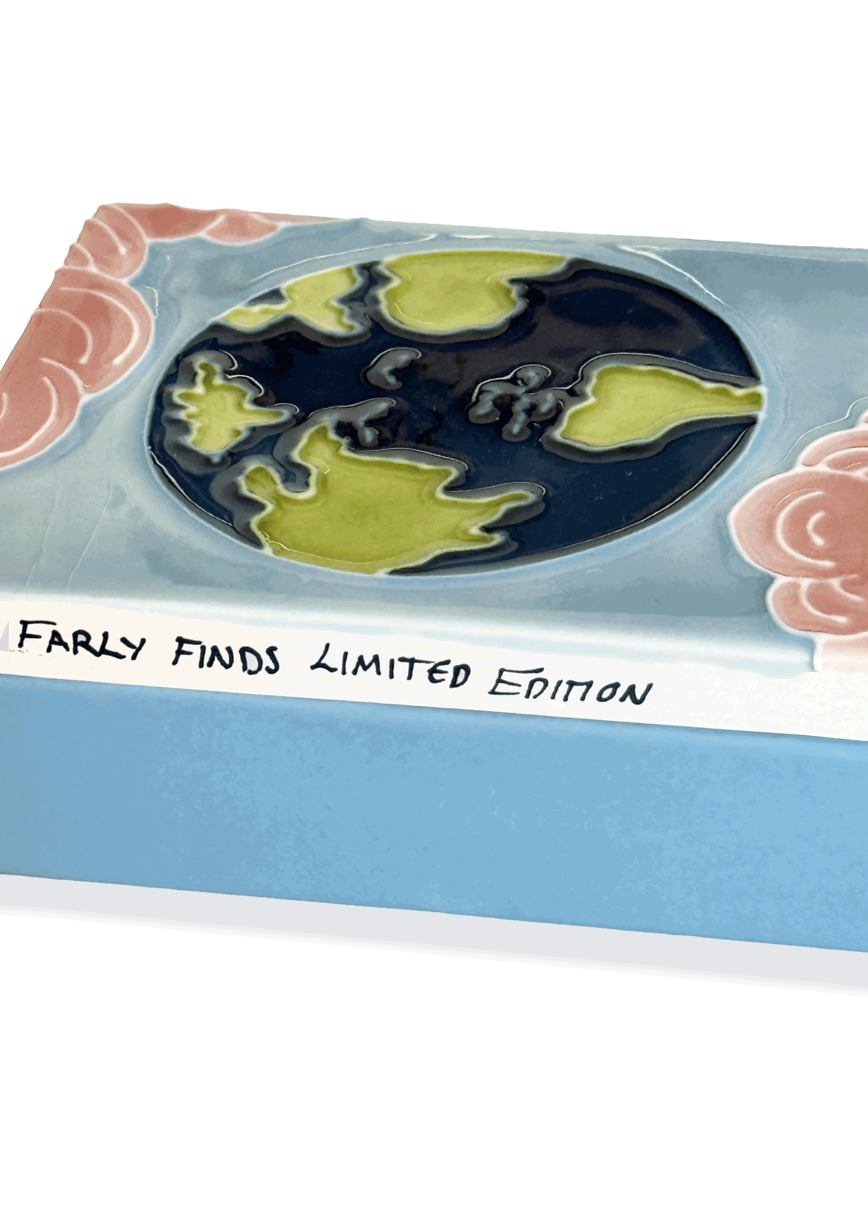
Inside, she showed me a series of exclusive oil paintings for the FARLY edit, paired with ceramic matchboxes that echo each piece. Each one is inspired by Tarot’s timeless symbols: The Sun, The Moon, Strength, The Star, and The World.


Jo grew up in rural Cheshire with a very creative mother, so she had a pencil or paintbrush in her hand for as long as she can remember. She then moved to London for fifteen years to work across editorial and marketing for British luxury brands.
Everything shifted in 2016, when Jo and her husband welcomed twin daughters and moved to Senegal for her husband’s work. The expat community there wanted stationery to send home but couldn’t buy any locally. Jo designed a small range of Senegalese greeting cards, which took off quickly. From there, her offering expanded into art prints, illustrations, wrapping papers, and event and wedding stationery.
The ceramics collection began with a matchbox she was given in a restaurant in Italy, something she treasured for many years. When she couldn’t find more anywhere online, she partnered with a ceramic studio in Stoke-on-Trent and designed her own. She launched with just 25 pieces each of The Sun and The Moon. They sold out within hours, leading to the development of her Tarot-inspired ceramic collection, now one of her signature ranges.


The FARLY Edit
For FARLY, Jo has created five one-off oil paintings on canvas, each inspired by a symbol from her Tarot ceramics, The Star, The Sun, The Moon, The World, and Strength. Accompanied by a limited-edition matchbox, especially well suited to this Christmassy time of year.
Tarot has been a recurring thread in Jo’s work, largely because its symbols feel instantly familiar. Though often linked to spirituality today, Tarot first appeared in 15th-century Europe as a card game, long before it was used for reflection or personal meaning. Over time, people began to read its imagery as a way to understand the themes that shape everyday life — renewal, clarity, strength, change.
Those timeless ideas are why Tarot still resonates. The symbols offer an easy way to pause, reflect, and find reassurance. Jo’s paintings and matchboxes borrow from that imagery with playful lightness.


Creative Process
Working in oils for this FARLY edit is unusual for Jo, who typically uses brush pens, watercolours, ink, and ceramic glazes. Oils offered her more freedom and fluidity, without the constraints of glaze colours. She prepared each canvas with gesso and linseed oil to create a soft, slightly hazy surface, then built up skies, clouds, and foreground layer by layer with palette knives and large decorating brushes.
These paintings work in many settings, though Jo imagines them especially in children’s rooms, where their innocence and magic can shine. She describes the collection as “whimsical and light,” and sees the pieces working beautifully alone or grouped as a set of two or three.


Explore Jo’s full FARLY edit online, including five original oil paintings and accompanying ceramic matchboxes. Each piece is available in limited quantities and created exclusively for this collaboration. The matchboxes, in particular, make an excellent Christmas gift—especially for those impossible-to-buy-for people, when you want something charming, meaningful, and genuinely unique.
Have lovely Christmas!
With love
Farly x
